CONTENTS
- DESCRIPTION
- SYNOPSIS
- EXAMPLES
- WORKBOOK METHOD
- WORKSHEET METHOD
- PAGE SET-UP METHOD
- CELL FORMATTING
- FORMAT METHODS
- COLORS IN EXCEL
- DATES AND TIME IN EXCEL
- OUTLINES AND GROUPING IN EXCEL
- DATA VALIDATION IN EXCEL
- CONDITIONAL FORMATTING IN EXCEL
- SPARKLINES IN EXCEL
- TABLES IN EXCEL
- FORMURAS AND FUNCTIONS IN EXCEL
- CHART METHODS
- CHART FONTS
- CHART LAYOUT
- SHAPE
- COMPATIBILITY WITH WRITEEXCEL
SYNOPSIS
To create a simple Excel file with a chart using WriteXLSX:
require 'write_xlsx'

workbook  = WriteXLSX.new('chart.xlsx')
worksheet = workbook.add_worksheet

# Add the worksheet data the chart refers to.
data = [
    [ 'Category', 2, 3, 4, 5, 6, 7 ],
    [ 'Value',    1, 4, 5, 2, 1, 5 ]

]

worksheet.write('A1', data)

# Add a worksheet chart.
chart = workbook.add_chart(type: 'column')

# Configure the chart.
chart.add_series(
    categories: '=Sheet1!$A$2:$A$7',
    values:     '=Sheet1!$B$2:$B$7'
)

workbook.close
DESCRIPTION
The Chart module is an abstract base class for modules that implement charts in WriteXLSX. The information below is applicable to all of the available subclasses.
The Chart module isn’t used directly.
A chart object is created via the Workbook
add_chart() method where the chart type is specified:
chart = workbook.add_chart(type: 'column')
Currently the supported chart types are:
- area
Creates an Area (filled line) style chart. See WriteXLSX::Chart::Area.
- bar
Creates a Bar style (transposed histogram) chart. See WriteXLSX::Chart::Bar.
- column
Creates a column style (histogram) chart. See WriteXLSX::Chart::Column.
- line
Creates a Line style chart. See WriteXLSX::Chart::Line.
- pie
Creates a Pie style chart. See WriteXLSX::Chart::Pie.
- doughnut
Creates a Doughnut style chart. See WriteXLSX::Chart::Doughnut.
- scatter
Creates a Scatter style chart. See WriteXLSX::Chart::Scatter.
- stock
Creates a Stock style chart. See WriteXLSX::Chart::Stock.
- radar
Creates a Radar style chart. See WriteXLSX::Chart::Radar.
Chart subtypes are also supported in some cases:
workbook.add_chart(type: 'bar', subtype: 'stacked')
The currently available subtypes are:
area
    stacked
    percent_stacked

bar
    stacked
    percent_stacked

column
    stacked
    percent_stacked

scatter
    straight_with_markers
    straight
    smooth_with_markers
    smooth

line
    stacked
    percent_stacked

radar
    with_markers
    filled
CHART METHODS
Methods that are common to all chart types are documented below. See the documentation for each of the above chart modules for chart specific information.
- add_series
- set_x_axis
- set_y_axis
- set_x2_axis
- set_y2_axis
- set_size
- set_title
- set_legend
- set_chartarea
- set_plotarea
- set_style
- set_table
- set_up_down_bars
- set_drop_lines
- set_high_low_lines
- show_blanks_as
- show_na_as_empty_cell
- show_hidden_data
- show_na_as_empty_cell
add_series()
In an Excel chart a “series” is a collection of information such as values, X axis labels and the formatting that define which data is plotted.
With an WriteXLSX chart object the add_series() method is used
to set the properties for a series:
chart.add_series(
    categories: '=Sheet1!$A$2:$A$10', # Optional.
    values:     '=Sheet1!$B$2:$B$10', # Required.
    line:       { color: 'blue' }
)
The properties that can be set are:
:values
This is the most important property of a series and must be set for every chart object. It links the chart with the worksheet data that it displays. A formula or array can be used for the data range, see below.
:categories
This sets the chart category labels.
The category is more or less the same as the X axis.
In most chart types the :categories property is optional and the chart
will just assume a sequential series from 1 .. n.
:name
Set the name for the series. The name is displayed in the chart legend and in the formula bar. The name property is optional and if it isn’t supplied it will default to Series 1 .. n.
:line
Set the properties of the series line type such as colour and width. See the CHART FORMATTING section below.
:border
Set the border properties of the series such as colour and style. See the CHART FORMATTING section below.
:fill
Set the fill properties of the series such as colour. See the CHART FORMATTING section below.
:marker
Set the properties of the series marker such as style and colour. See the SERIES OPTIONS section below.
:trendline
Set the properties of the series trendline such as linear, polynomial and moving average types. See the SERIES OPTIONS section below.
:smooth
The smooth option is used to set the smooth property of a line series. See the SERIES OPTIONS section below.
:y_error_bars
Set vertical error bounds for a chart series. See the SERIES OPTIONS section below.
:x_error_bars
Set horizontal error bounds for a chart series. See the SERIES OPTIONS section below.
:data_labels
Set data labels for the series. See the SERIES OPTIONS section below.
:points
Set properties for individual points in a series. See the SERIES OPTIONS section below.
:invert_if_negative
Invert the fill colour for negative values. Usually only applicable to column and bar charts.
:overlap
Set the overlap between series in a Bar/Column chart. The range is +/- 100. Default is 0.
overlap: 20,
Note, it is only necessary to apply this property to one series of the chart.
:gap
Set the gap between series in a Bar/Column chart. The range is 0 to 500. Default is 150.
gap: 200,
Note, it is only necessary to apply this property to one series of the chart.
The categories and values can take either a range formula such as
=Sheet1!$A$2:$A$7 or, more usefully when generating the range
programmatically, an array with zero indexed row/column values:
[ sheetname, row_start, row_end, col_start, col_end ]
The following are equivalent:
chart.add_series(categories: '=Sheet1!$A$2:$A$7'     ) # Same as ...
chart.add_series(categories: [ 'Sheet1', 1, 6, 0, 0 ]) # Zero-indexed.
You can add more than one series to a chart. In fact, some chart types such as stock require it. The series numbering and order in the Excel chart will be the same as the order in which they are added in WriteXLSX.
# Add the first series.
chart.add_series(
    categories: '=Sheet1!$A$2:$A$7',
    values:     '=Sheet1!$B$2:$B$7',
    name:       'Test data series 1'
)

# Add another series. Same categories. Different range values.
chart.add_series(
    categories: '=Sheet1!$A$2:$A$7',
    values:     '=Sheet1!$C$2:$C$7',
    name:       'Test data series 2'
)
It is also possible to specify non-contiguous ranges:
chart.add_series(
  categories: '=(Sheet1!$A$1:$A$9,Sheet1!$A$14:$A$25)',
  values:     '=(Sheet1!$B$1:$B$9,Sheet1!$B$14:$B$25)'
)
set_x_axis()
The set_x_axis() method is used to set properties of the X axis.
chart.set_x_axis(name: 'Quarterly results')
The properties that can be set are:
:name
:name_font
:name_layout
:num_font
:num_format
:pattern
:gradient
:min
:max
:minor_unit
:major_unit
:interval_unit
:crossing
:reverse
:log_base
:label_position
:major_gridlines
:minor_gridlines
:visible
:date_axis
:text_axis
:minor_unit_type
:major_unit_type
:display_units
:display_units_visible
These are explained below. Some properties are only applicable to value or category axes, as indicated. See “Value and Category Axes” for an explanation of Excel’s distinction between the axis types.
:name
Set the name (title or caption) for the axis. The name is displayed below the X axis. The name property is optional. The default is to have no axis name. (Applicable to category and value axes).
chart.set_x_axis(name: 'Quarterly results')
The name can also be a formula such as =Sheet1!$A$1.
:name_font
Set the font properties for the axis title. (Applicable to category and value axes).
chart.set_x_axis(name_font: {name: 'Arial', size: 10})
See the CHART FONTS section below.
:name_layout
Set the x, y position of the axis title in chart relative units. (Applicable to category and value axes).
chart.set_x_axis(
  name:        'X axis',
  name_layout: {
    x: 0.34,
    y: 0.85
  }
}
See the CHART LAYOUT section below.
:num_font
Set the font properties for the axis numbers. (Applicable to category and value axes).
chart.set_x_axis(num_font: {bold: 1, italic: 1})
See the CHART FONTS section below.
:num_format
Set the number format for the axis. (Applicable to category and value axes).
chart.set_x_axis(num_format: '#,##0.00')
chart.set_y_axis(num_format: '0.00%'   )
The number format is similar to the Worksheet Cell Format :num_format apart
from the fact that a format index cannot be used.
The explicit format string must be used as show above.
See
“set_num_format()”
in WriteXLSX for more information.
:line
Set the properties of the axis line type such as color and width. See the CHART FORMATTING section below.
chart.set_x_axis(line: { none: 1 })
:fill
Set the fill properties of the axis such as color. See the CHART FORMATTING section below. Note, in the Excel the axis fill is applied to the area of the numbers of the axis and not to the area of the axis bounding box. That background is set from the chartarea fill.
:pattern
Set the pattern properties of the axis such as color. See the CHART FORMATTING section below.
:gradient
Set the gradient properties of the axis such as color. See the CHART FORMATTING section below.
:min
Set the minimum value for the axis range. (Applicable to value axes only.)
chart.set_x_axis(min: 20)
:max
Set the maximum value for the axis range. (Applicable to value axes only.)
chart.set_x_axis(max: 80)
:minor_unit
Set the increment of the minor units in the axis range. (Applicable to value axes only.)
chart.set_x_axis(minor_unit: 0.4)
:major_unit
Set the increment of the major units in the axis range. (Applicable to value axes only.)
chart.set_x_axis(major_unit: 2)
:interval_unit
Set the interval unit for a category axis. (Applicable to category axes only.)
chart.set_x_axis(interval_unit: 2)
:crossing
Set the position where the y axis will cross the x axis. (Applicable to category and value axes.)
The crossing value can either be a number value or the string 'max' or 'min'to set the crossing at the maximum/minimum axis value.
chart.set_x_axis(crossing: 3)
# or
chart.set_x_axis(crossing: 'max')
For category axes the numeric value must be an integer to represent the category number that the axis crosses at. For value axes it can have any value associated with the axis.
If crossing is omitted (the default) the crossing will be set automatically by Excel based on the chart data.
:position_axis
Position the axis on or between the axis tick marks. (Applicable to category axes only.)
There are two allowable values on_tick and between:
chart.set_x_axis(position_axis: 'on_tick')
chart.set_x_axis(position_axis: 'between')
:reverse
Reverse the order of the axis categories or values. (Applicable to category and value axes.)
chart.set_x_axis(reverse: 1)
:log_base
Set the log base of the axis range. (Applicable to value axes only.)
chart.set_x_axis(log_base: 10)
:label_position
Set the “Axis labels” position for the axis. The following positions are available:
next_to (the default)
high
low
none
:major_gridlines
Configure the major gridlines for the axis. The available properties are:
:visible
:line
For example:
chart.set_x_axis(
    major_gridlines: {
        visible: 1,
        line:    { color: 'red', width: 1.25, dash_type: 'dash' }
    }
)
The visible property is usually on for the X-axis but it depends on the type of chart.
The line property sets the gridline properties such as colour and width. See the CHART FORMATTING section below.
:minor_gridlines
This takes the same options as major_gridlines above.
The minor gridline visible property is off by default for all chart types.
:visible
Configure the visibility of the axis.
chart.set_x_axis(visible: 0)
:date_axis
This option is used to treat a category axis with date or time data as a Date Axis. (Applicable to category axes only.)
chart.set_x_axis(date_axis: 1)
This option also allows you to set max and min values for a category axis
which isn’t allowed by Excel for non-date category axes.
See Date Category Axes for more details.
:text_axis
This option is used to treat a category axis explicitly as a Text Axis. (Applicable to category axes only.)
chart.set_x_axis(text_axis: 1)
:minor_unit_type
For date_axis axes, see above, this option is used to set the type of the minor
units. (Applicable to date category axes only.)
chart.set_x_axis(
  date_axis:       1,
  minor_unit:      4,
  minor_unit_type: 'month'
)
The allowable values for this option are ‘days’, ‘months’ and ‘years’.
:major_unit_type
Same as :minor_unit_type, see above, bur for major axes unit types.
More than one property can be set in a call to set_x_axis():
chart.set_x_axis(
    name: 'Quarterly results',
    min:  10,
    max:  80
)
:display_units
Set the display units for the axis. This can be useful if the axis numbers are very large but you don’t want to represent them in scientific notation. (Applicable to value axes only.) The available display units are:
 hundreds
 thousands
 ten_thousands
 hundred_thousands
 millions
 ten_millions
 hundred_millions
 billions
 trillions
Example:
 chart.set_x_axis(display_units: 'thousands')
 chart.set_y_axis(display_units: 'millions')
:display_units_visible
Control the visibility of the display units turned on by the previous option. This option is on by default. (Applicable to value axes only.)::
 chart.set_x_axis(display_units:         'thousands',
                  display_units_visible: 0 )
set_y_axis()
The set_y_axis() method is used to set properties of the Y axis.
The properties that can be set are the same as for set_x_axis, see above.
set_x2_axis()
The set_x2_axis() method is used to set properties of the secondary X axis.
The properties that can be set are the same as for set_x_axis(), see above.
The default properties for this axis are:
label_position: 'none',
crossing:       'max',
visible:        0,
set_y2_axis()
The set_y2_axis() method is used to set properties of the secondary Y axis.
The properties that can be set are the same as for set_x_axis(), see above.
The default properties for this axis are:
major_gridlines: { visible: 0 }
combine()
The chart combine method is used to combine two charts of different
types, for example a column and line chart:
column_chart = workbook.add_chart(type: 'column', embedded: 1)

# Configure the data series for the primary chart.
column_chart.add_series(...)

# Create a new column chart. This will use this as the secondary chart.
line_chart = workbook.add_chart(type: 'line', embedded: 1)

# Configure the data series for the secondary chart.
line_chart.add_series(...)

# Combine the charts.
column_chart.combine(line_chart)
See L
set_size()
The set_size() method is used to set the dimensions of the chart.
The size properties that can be set are:
 :width
 :height
 :x_scale
 :y_scale
 :x_offset
 :y_offset
The :width and :height are in pixels.
The default chart width is 480 pixels and the default height is 288 pixels.
The size of the chart can be modified by setting the :width and :height
or by setting the :x_scale and :y_scale:
chart.set_size(width: 720, height: 576)

# Same as:

chart.set_size(x_scale: 1.5, y_scale: 2)
The :x_offset and :y_offset position the top left corner of the chart
in the cell that it is inserted into.
Note: the :x_scale, :y_scale, :x_offset and :y_offset parameters
can also be set via the insert_chart() method:
worksheet.insert_chart(
  'E2', chart,
  x_offset: 2,   y_offset: 4,
  x_scale:  1.5, y_scale:  2
)
set_title()
The set_title() method is used to set properties of the chart title.
chart.set_title(name: 'Year End Results')
The properties that can be set are:
:name
Set the name (title) for the chart.
The name is displayed above the chart.
The name can also be a formula such as =Sheet1!$A$1.
The name property is optional.
The default is to have no chart title.
:name_font
Set the font properties for the chart title. See the CHART FONTS section below.
:overlay
Allow the title to be overlaid on the chart. Generally used with the layout property below.
:layout
Set the x, y position of the title in chart relative units.
chart.set_title(
  name:    'Title',
  overlay: 1,
  layout:  {
    x: 0.42,
    y: 0.14
  }
}
See the CHART LAYOUT section below.
none
By default Excel adds an automatic chart title to charts with a single series and a user defined series name. The none option turns this default title off. It also turns off all other set_title option.
chart.set_title(none: 1)
set_legend()
The set_legend() method is used to set properties of the chart legend.
The properties that can be set are:
:none
The :none option turns off the chart legend. In Excel chart legend are on by default:
chart.set_legend(none: 1)
Note, for backward compatibility, it is also possible to turn off the legend via the :position property:
chart.set_legend(position: 'none')
:position
Set the position of the chart legend.
chart.set_legend(position: 'bottom')
The default legend position is right.
The available positions are:
top
bottom
left
right
top_right
overlay_left
overlay_right
overlay_top_right
none
:border
Set the border properties of the legend such as colour and style.
:fill
Set the fill properties of the legend such as colour.
:pattern
Set the pattern fill properties of the legend.
:gradient
Set the gradient fill properties of the legend.
:font
Set the font properties of the chart legend.
chart.set_legend(
  font: { bold: 1, italic: 1 }
)
:delete_series
This allows you to remove 1 or more series from the legend (the series will still display on the chart). This property takes an array as an argument and the series are zero indexed:
# Delete/hide series index 0 and 2 from the legend.
chart.set_legend(delete_series: [0, 2])
:layout
Set the (x, y) position of the legend in chart relative units:
chart.set_legend(
  layout: {
    x:      0.80,
    y:      0.37,
    width:  0.12,
    height: 0.25
  }
)
See the CHART LAYOUT section below.
set_chartarea()
The set_chartarea() method is used to set the properties of the chart area.
chart.set_chartarea(
    border: { none:  1 },
    fill:   { color: 'red' }
)
The properties that can be set are:
:border
Set the border properties of the chartarea such as colour and style. See the CHART FORMATTING section below.
:fill
Set the fill properties of the chartarea such as colour. See the CHART FORMATTING section below.
:pattern
Set the pattern fill properties of the chartarea such as colour. See the CHART FORMATTING section below.
:gradient
Set the gradient fill properties of the chartarea such as colour. See the CHART FORMATTING section below.
set_plotarea()
The set_plotarea() method is used to set properties of the plot area of a chart.
chart.set_plotarea(
    border: { color: 'yellow', width: 1, dash_type: 'dash' },
    fill:   { color: '#92D050' }
)
The properties that can be set are:
:border
Set the border properties of the plotarea such as colour and style. See the CHART FORMATTING section below.
:fill
Set the fill properties of the plotarea such as colour. See the CHART FORMATTING section below.
:pattern
Set the pattern fill properties of the plotarea such as colour. See the CHART FORMATTING section below.
:gradient
Set the gradient fill properties of the plotarea such as colour. See the CHART FORMATTING section below.
:layout
Set the (x, y) position of the plotarea in chart relative units:
chart.set_plotarea(
  layout: {
    x:      0.35,
    y:      0.26,
    width:  0.62,
    height: 0.50
  }
)
set_style()
The set_style() method is used to set the style of the chart to one of
the 42 built-in styles available on the ‘Design’ tab in Excel:
chart.set_style(4)
The default style is 2.
set_table()
The set_table() method adds a data table below the horizontal axis with
the data used to plot the chart.
chart.set_table
The available options, with default values are:
vertical:   1,  # Display vertical lines in the table.
horizontal: 1,  # Display horizontal lines in the table.
outline:    1,  # Display an outline in the table.
show_keys:  0   # Show the legend keys with the table data.
font:       {}  # Standard chart font properties.
The data table can only be shown with Bar, Column, Line, Area and stock charts. For font properties see the CHART FONTS section below.
set_up_down_bars()
The set_up_down_bars() method adds Up-Down bars to Line charts to indicate
the difference between the first and last data series.
chart.set_up_down_bars
It is possible to format the up and down bars to add fill, pattern, gradient and border properties if required. See the CHART FORMATTING section below.
chart.set_up_down_bars(
    up:   { fill: { color: 'green' } },
    down: { fill: { color: 'red' } }
)
Up-down bars can only be applied to Line charts and to Stock charts (by default).
set_drop_lines
The set_drop_lines() method adds Drop Lines to charts to show the Category
value of points in the data.
chart.set_drop_lines
It is possible to format the Drop Line line properties if required. See the CHART FORMATTING section below.
chart.set_drop_lines(line: { color: 'red', dash_type: 'square_dot' } )
Drop Lines are only available in Line, Area and Stock charts.
set_high_low_lines
The set_high_low_lines() method adds High-Low lines to charts to show the
maximum and minimum values of points in a Category.
chart.set_high_low_lines
It is possible to format the High-Low Line line properties if required. See the CHART FORMATTING section below.
chart.set_high_low_lines( line: { color: 'red' } )
High-Low Lines are only available in Line and Stock charts.
show_blanks_as()
The show_blanks_as() method controls how blank data is displayed in a chart.
chart.show_blanks_as( 'span' )
The available options are:
    gap    # Blank data is shown as a gap. The default.
    zero   # Blank data is displayed as zero.
    span   # Blank data is connected with a line.
show_na_as_empty_cell()
The show_na_as_empty_cell method enables the option to display #N/A as a blank cell in a chart.
show_hidden_data()
Display data in hidden rows or columns on the chart.
chart.show_hidden_data
show_na_as_empty_cell()
The show_na_as_empty_cell method enables the option to display #N/A as a blank cell in a chart.
SERIES OPTIONS
This section details the following properties of add_series() in more detail:
:marker
:trendline
:y_error_bars
:x_error_bars
:data_labels
:points
:smooth
:marker
The marker format specifies the properties of the markers used to distinguish series on a chart. In general only Line and Scatter chart types and trendlines use markers.
The following properties can be set for marker formats in a chart.
:type
:size
:border
:fill
:pattern
:gradient
The type property sets the type of marker that is used with a series.
chart.add_series(
    values:     '=Sheet1!$B$1:$B$5',
    marker:     { type: 'diamond' }
)
The following type properties can be set for marker formats in a chart. These are shown in the same order as in the Excel format dialog.
automatic
none
square
diamond
triangle
x
star
short_dash
long_dash
circle
plus
The automatic type is a special case which turns on a marker using the default marker style for the particular series number.
chart.add_series(
    values:     '=Sheet1!$B$1:$B$5',
    marker:     { type: 'automatic' }
)
If automatic is on then other marker properties such as size, border or fill cannot be set.
The size property sets the size of the marker and is generally used in conjunction with type.
chart.add_series(
    values:     '=Sheet1!$B$1:$B$5',
    marker:     { type: 'diamond', size: 7 }
)
Nested border and fill properties can also be set for a marker. See the CHART FORMATTING section below.
chart.add_series(
    values:     '=Sheet1!$B$1:$B$5',
    marker:     {
        type:    'square',
        size:    5,
        border:  { color: 'red' },
        fill:    { color: 'yellow' },
    }
)
:trendline
A trendline can be added to a chart series to indicate trends in the data such as a moving average or a polynomial fit.
The following properties can be set for trendlines in a chart series.
:type
:order             (for polynomial trends)
:period            (for moving average)
:forward           (for all except moving average)
:backward          (for all except moving average)
:name
:line
:intercept         (for exponential, linear and plynomial only)
:display_equation  (for all except moving average)
:display_r_squared (for all except moving average)
The type property sets the type of trendline in the series.
chart.add_series(
    values:     '=Sheet1!$B$1:$B$5',
    trendline:  { type: 'linear' }
)
The available trendline types are:
exponential
linear
log
moving_average
polynomial
power
A polynomial trendline can also specify the order of the polynomial. The default value is 2.
chart.add_series(
    values:    '=Sheet1!$B$1:$B$5',
    trendline: {
        type:  'polynomial',
        order: 3
    }
)
A moving_average trendline can also specify the period of the moving average. The default value is 2.
chart.add_series(
    values:     '=Sheet1!$B$1:$B$5',
    trendline:  {
        type:   'moving_average',
        period: 3,
    }
)
The forward and backward properties set the forecast period of the trendline.
chart.add_series(
    values:    '=Sheet1!$B$1:$B$5',
    trendline: {
        type:     'linear',
        forward:  0.5,
        backward: 0.5,
    }
)
The name property sets an optional name for the trendline that will appear in the chart legend. If it isn’t specified the Excel default name will be displayed. This is usually a combination of the trendline type and the series name.
chart.add_series(
  values:    '=Sheet1!$B$1:$B$5',
  trendline: {
    type: 'linear',
    name: 'Interpolated trend',
  }
)
The intercept property sets the point where the trendline crosses the Y (value) axis:
chart.add_series(
  values:    '=Sheet1!$B$1:$B$5',
  trendline: {
    type:      'linear',
    intercept: 0.8
    }
)
The display_equation property displays the trendline equation on the chart.
chart.add_series(
  values:    '=Sheet1!$B$1:$B$5',
  trendline: {
    type:             'linear',
    display_equation: 1
  }
)
The display_r_squared property displays the R squared value of the trendline on the chart.
chart.add_series(
  values:    '=Sheet1!$B$1:$B$5',
  trendline: {
    type:              'linear',
    display_r_squared: 1
  }
)
Several of these properties can be set in one go:
chart.add_series(
  values:    '=Sheet1!$B$1:$B$5',
  trendline: {
    type:              'linear',
    name:              'My trend name',
    forward:           0.5,
    backward:          0.5,
    intercept:         1.5,
    display_equeation: 1,
    display_r_squared: 1,
    line:              {
      color:     'red',
      width:     1,
      dash_type: 'long_dash'
    }
  }
)
Trendlines cannot be added to series in a stacked chart or pie chart, radar chart, doughnut or (when implemented) to 3D, or surface charts.
Error Bars
Error bars can be added to a chart series to indicate error bounds in the data. The error bars can be vertical y_error_bars (the most common type) or horizontal x_error_bars (for Bar and Scatter charts only).
The following properties can be set for error bars in a chart series.
:type
:value        (for all types except standard error)
:plus_values  (for custom only)
:minus_values (for custom only)
:direction
:end_style
:line
The type property sets the type of error bars in the series.
chart.add_series(
    values:       '=Sheet1!$B$1:$B$5',
    y_error_bars: { type: 'standard_error' },
)
The available error bars types are available:
fixed
percentage
standard_deviation
standard_error
custom
All error bar types, except for standard_error and custom must also have a value associated with it for the error bounds:
chart.add_series(
    values:       '=Sheet1!$B$1:$B$5',
    y_error_bars: {
        type:  'percentage',
        value: 5
    }
)
The error bar type must specify plus_values and minus_values which should either by a Sheet1!$A$1:$A$5 type range formula or an array of values:
chart.add_series(
    categories:   '=Sheet1!$A$1:$A$5',
    values:       '=Sheet1!$B$1:$B$5',
    y_error_bars: {
        type:         'custom',
        plus_values:  '=Sheet1!$C$1:$C$5',
        minus_values: '=Sheet1!$D$1:$D$5'
    }
)

# or

chart.add_series(
    categories:   '=Sheet1!$A$1:$A$5',
    values:       '=Sheet1!$B$1:$B$5',
    y_error_bars: {
        type:         'custom',
        plus_values:  [1, 1, 1, 1, 1],
        minus_values: [2, 2, 2, 2, 2]
    }
)
Note, as in Excel the items in the minus_values do not need to be negative.
The direction property sets the direction of the error bars. It should be one of the following:
plus    # Positive direction only.
minus   # Negative direction only.
both    # Plus and minus directions, The default.
The end_style property sets the style of the error bar end cap. The options are 1 (the default) or 0 (for no end cap):
chart.add_series(
    values:       '=Sheet1!$B$1:$B$5',
    y_error_bars: {
        type:      'fixed',
        value:     2,
        end_style: 0,
        direction: 'minus'
    },
)
Data Labels
Data labels can be added to a chart series to indicate the values of the plotted data points.
The following properties can be set for :data_labels formats in a chart.
:value
:category
:series_name
:position
:percentage
:leader_lines
:separator
:legend_key
:num_format
:font
:border
:fill
:pattern
:gradient
:custom
The value property turns on the Value data label for a series.
chart.add_series(
    values:      '=Sheet1!$B$1:$B$5',
    data_labels: { value: 1 }
)
The category property turns on the Category Name data label for a series.
chart.add_series(
    values:      '=Sheet1!$B$1:$B$5',
    data_labels: { category: 1 }
)
The series_name property turns on the Series Name data label for a series.
chart.add_series(
    values:      '=Sheet1!$B$1:$B$5',
    data_labels: { series_name: 1 }
)
The position property is used to position the data label for a series.
chart.add_series(
    values:      '=Sheet1!$B$1:$B$5',
    data_labels: { value: 1, position: 'center' }
)
In Excel the data label positions vary for different chart types. The allowable positions are:
|  Position     |  Line     |  Bar      |  Pie      |  Area     |
|               |  Scatter  |  Column   |  Doughnut |  Radar    |
|               |  Stock    |           |           |           |
|---------------|-----------|-----------|-----------|-----------|
|  center       |  Yes      |  Yes      |  Yes      |  Yes*     |
|  right        |  Yes*     |           |           |           |
|  left         |  Yes      |           |           |           |
|  above        |  Yes      |           |           |           |
|  below        |  Yes      |           |           |           |
|  inside_base  |           |  Yes      |           |           |
|  inside_end   |           |  Yes      |  Yes      |           |
|  outside_end  |           |  Yes*     |  Yes      |           |
|  best_fit     |           |           |  Yes*     |           |
Note: The * indicates the default position for each chart type in Excel, if a position isn’t specified.
The :percentage property is used to turn on the display of data labels as
a Percentage for a series. It is mainly used for pie and doughnut charts.
chart.add_series(
    values:      '=Sheet1!$B$1:$B$5',
    data_labels: { percentage: 1 }
)
The :leader_lines property is used to turn on Leader Lines for the data label for a series. It is mainly used for pie charts.
chart.add_series(
    values:      '=Sheet1!$B$1:$B$5',
    data_labels: { value: 1, leader_lines: 1 }
)
Note: Even when leader lines are turned on they aren’t automatically visible in Excel or WriteXLSX. Due to an Excel limitation (or design) leader lines only appear if the data label is moved manually or if the data labels are very close and need to be adjusted automatically.
The :separator property is used to change the separator between multiple data label items:
chart.add_series(
    values:      '=Sheet1!$B$1:$B$5',
    data_labels: { percentage: 1 },
    data_labels: { value: 1, category: 1, separator: "\n" }
)
The :separator value must be one of the following strings:
        ','
        ';'
        '.'
        "\n"
        ' '
The :legend_key property is used to turn on Legend Key for the data label for a series:
chart.add_series(
    values:      '=Sheet1!$B$1:$B$5',
    data_labels: { value: 1, legend_key: 1 }
)
The :num_format property is used to set the number format for the data labels.
chart.add_series(
    values:      '=Sheet1!$A$1:$A$5',
    data_labels: { value: 1, num_format: '#,##0.00' }
)
The number format is similar to the Worksheet Cell Format num_format apart from the fact that a format index cannot be used. The explicit format string must be used as shown above.
The :font property is used to set the font properties of the data labels in a series:
chart.add_series(
    values:      '=Sheet1!$A$1:$A$5',
    data_labels: {
        value: 1,
        font:  { name: 'Consolas' }
    }
)
The :font property is also used to rotate the data labels in a series:
chart.add_series(
    values:      '=Sheet1!$A$1:$A$5',
    data_labels: {
        value: 1,
        font:  { rotate: 45 }
    }
)
See the CHART FONTS section below.
The :custom property sets the :border properties of the data labels such as colour and style. See the CHART FORMATTING section below.
The :fill property sets the fill properties of the data labels such as colour. See the CHART FORMATTING section below.
Example of setting data label formatting:
chart.add_series(
  categories: '=Sheet1!$A$2:$A$7',
  values:     '=Sheet1!$B$2:$B$7',
  data_labels: { value:  1,
                    border: {color: 'red'},
                    fill:   {color: 'yellow'} }
)
The :pattern property sets the pattern properties of the data labels. See the CHART FORMATTING section below.
The :gradient property sets the gradient properties of the data labels. See the CHART FORMATTING section below.
The :custom property is used to set the properties of individual data labels, see below.
Custom Data Labels
The custom property data label property is used to set the properties of individual data labels in a series. The most common use for this is to set custom text or number labels:
custom_labels = [
    { value: 'Jan' },
    { value: 'Feb' },
    { value: 'Mar' },
    { value: 'Apr' },
    { value: 'May' },
    { value: 'Jun' }
]

chart.add_series(
    categories:  '=Sheet1!$A$2:$A$7',
    values:      '=Sheet1!$B$2:$B$7',
    data_labels: { value: 1, custom: custom_labels }
)
As shown in the previous examples th custom property should be a list of dicts. Any property dict that is set to nil or not included in the list will be assigned the default data label value:
custom_labels = [
    nil,
    { value: 'Feb' },
    { value: 'Mar' },
    { value: 'Apr' }
]
The property elements of the custom lists should be dicts with the following allowable keys/sub-properties:
:value
:font
:border
:fill
:pattern
:gradient
:delete
The :value property should be a string, number or formula string that refers to a cell from which the value will be taken:
custom_labels = [
    { value: '=Sheet1!$C$2' },
    { value: '=Sheet1!$C$3' },
    { value: '=Sheet1!$C$4' },
    { value: '=Sheet1!$C$5' },
    { value: '=Sheet1!$C$6' },
    { value: '=Sheet1!$C$7' }
]
The :font property is used to set the font of the custom data label of a series (See the CHART FONTS section below):
custom_labels = [
    { value: '=Sheet1!$C$1', font: { color: 'red' } },
    { value: '=Sheet1!$C$2', font: { color: 'red' } },
    { value: '=Sheet1!$C$2', font: { color: 'red' } },
    { value: '=Sheet1!$C$4', font: { color: 'red' } },
    { value: '=Sheet1!$C$5', font: { color: 'red' } },
    { value: '=Sheet1!$C$6', font: { color: 'red' } }
]
The :border property sets the border properties of the data labels such as colour and style. See the CHART FORMATTING section below.
The :fill property sets the fill properties of the data labels such as colour. See the CHART FORMATTING section below.
Example of setting custom data label formatting:
custom_labels = [
    { value: 'Jan', border: {color: 'blue'} },
    { value: 'Feb' },
    { value: 'Mar' },
    { value: 'Apr' },
    { value: 'May' },
    { value: 'Jun', fill:   {color: 'green'} }
]
The pattern property sets the pattern properties of the data labels. See the CHART FORMATTING section below.
The :gradient property sets the gradient properties of the data labels. See the CHART FORMATTING section below.
The :delete property can be used to delete labels in a series. This can be useful if you want to highlight one or more cells in the series, for example the maximum and the minimum:
custom_labels = [
    nil,
    { delete: 1 },
    { delete: 1 },
    { delete: 1 },
    { delete: 1 },
    nil
]
Points
In general formatting is applied to an entire series in a chart. However, it is occasionally required to format individual points in a series. In particular this is required for Pie and Doughnut charts where each segment is represented by a point.
In these cases it is possible to use the points property of add_series():
chart.add_series(
    values: '=Sheet1!$A$1:$A$3',
    points: [
        { fill: { color: '#FF0000' } },
        { fill: { color: '#CC0000' } },
        { fill: { color: '#990000' } },
    ]
)
The points property takes an array of format options
(see the CHART FORMATTING section below).
To assign default properties to points in a series pass nil values in the array:
# Format point 3 of 3 only.
chart.add_series(
    values: '=Sheet1!$A$1:$A$3',
    points: [
        nil,
        nil,
        { fill: { color: '#990000' } },
    ]
)

# Format the first point only.
chart.add_series(
    values: '=Sheet1!$A$1:$A$3',
    points: [ { fill: { color: '#FF0000' } } ]
)
:Smooth
The :smooth option is used to set the smooth property of a line series.
It is only applicable to the Line and Scatter chart types.
chart.add_series( values: '=Sheet1!$C$1:$C$5',
                  smooth: 1 )
CHART FORMATTING
The following chart formatting properties can be set for any chart object that they apply to (and that are supported by WriteXLSX) such as chart lines, column fill areas, plot area borders, markers, gridlines and other chart elements documented above.
:line
:border
:fill
:pattern
:gradient
Chart formatting properties are generally set using hash.
chart.add_series(
    values:     '=Sheet1!$B$1:$B$5',
    line:       { color: 'blue' }
)
In some cases the format properties can be nested. For example a marker may contain border and fill sub-properties.
chart.add_series(
    values:     '=Sheet1!$B$1:$B$5',
    line:       { color: 'blue' },
    marker:     {
        type:    'square',
        size:    5,
        border:  { color: 'red' },
        fill:    { color: 'yellow' },
    }
)
:line
The line format is used to specify properties of line objects that appear in a chart such as a plotted line on a chart or a border.
The following properties can be set for line formats in a chart.
:none
:color
:width
:dash_type
:transparency
The none property is used to turn the line off (it is always on by default except in Scatter charts). This is useful if you wish to plot a series with markers but without a line.
chart.add_series(
    values:     '=Sheet1!$B$1:$B$5',
    line:       { none: 1 }
)
The color property sets the color of the line.
chart.add_series(
    values:     '=Sheet1!$B$1:$B$5',
    line:       { color: 'red' }
)
The available colours are shown in the main WriteXLSX documentation. It is also possible to set the colour of a line with a HTML style RGB colour:
chart.add_series(
    line:       { color: '#FF0000' }
)
The width property sets the width of the line. It should be specified in increments of 0.25 of a point as in Excel.
chart.add_series(
    values:     '=Sheet1!$B$1:$B$5',
    line:       { width: 3.25 }
)
The dash_type property sets the dash style of the line.
chart.add_series(
    values:     '=Sheet1!$B$1:$B$5',
    line:       { dash_type: 'dash_dot' }
)
The following dash_type values are available. They are shown in the order that they appear in the Excel dialog.
solid
round_dot
square_dot
dash
dash_dot
long_dash
long_dash_dot
long_dash_dot_dot
The default line style is solid.
The transparency property sets the transparency of the line color in the integer range 1 - 100. The color must be set for transparency to work, it doesn’t work with an automatic/default color:
chart.add_series(
  values: '=Sheet1!$B$1:$B$5',
  line:   { color: 'yellow', transparency: 50 }
)
More than one line property can be specified at a time:
chart.add_series(
    values:     '=Sheet1!$B$1:$B$5',
    line:       {
        color:     'red',
        width:     1.25,
        dash_type: 'square_dot'
    }
)
:border
The border property is a synonym for line.
It can be used as a descriptive substitute for line in chart types such as Bar and Column that have a border and fill style rather than a line style. In general chart objects with a border property will also have a fill property.
Solid Fill
The fill format is used to specify filled areas of chart objects such as the interior of a column or the background of the chart itself.
The following properties can be set for fill formats in a chart.
:color
:none
The none property is used to turn the fill property off (it is generally on by default).
chart.add_series(
    values:     '=Sheet1!$B$1:$B$5',
    fill:       { none: 1 }
)
The color property sets the colour of the fill area.
chart.add_series(
    values:     '=Sheet1!$B$1:$B$5',
    fill:       { color: 'red' }
)
The available colours are shown in the main WriteXLSX documentation. It is also possible to set the colour of a fill with a HTML style RGB colour:
chart.add_series(
    fill:       { color: '#FF0000' }
)
The fill format is generally used in conjunction with a border format which has the same properties as a line format.
chart.add_series(
    values:     '=Sheet1!$B$1:$B$5',
    border:     { color: 'red' },
    fill:       { color: 'yellow' }
)
Pattern Fill
The pattern fill format is used to specify pattern filled areas of chart objects such as the interior of a column or the background of the chart itself.
The following properties can be set for C
:pattern:   the pattern to be applied (required)
:fg_color:  the foreground color of the pattern (required)
:bg_color:  the background color (optional, defaults to white)
For example:
chart.set_plotarea(
    pattern: {
        pattern:  'percent_5',
        fg_color: 'red',
        bg_color: 'yellow'
    }
)
The following patterns can be applied:
percent_5
percent_10
percent_20
percent_25
percent_30
percent_40
percent_50
percent_60
percent_70
percent_75
percent_80
percent_90
light_downward_diagonal
light_upward_diagonal
dark_downward_diagonal
dark_upward_diagonal
wide_downward_diagonal
wide_upward_diagonal
light_vertical
light_horizontal
narrow_vertical
narrow_horizontal
dark_vertical
dark_horizontal
dashed_downward_diagonal
dashed_upward_diagonal
dashed_horizontal
dashed_vertical
small_confetti
large_confetti
zigzag
wave
diagonal_brick
horizontal_brick
weave
plaid
divot
dotted_grid
dotted_diamond
shingle
trellis
sphere
small_grid
large_grid
small_check
large_check
outlined_diamond
solid_diamond
The foreground color, fg_color, is a required parameter and can be a Html style #RRGGBB string or a limited number of named colors. The available colours are shown in the main documentation.
The background color, bg_color, is optional and defaults to black.
If a pattern fill is used on a chart object it overrides the solid fill properties of the object.
Gradient Fill
The gradient fill format is used to specify gradient filled areas of chart objects such as the interior of a column or the background of the chart itself.
The following properties can be set for gradient fill formats in a chart:
:colors:    a list of colors
:positions: an optional list of positions for the colors
:type:      the optional type of gradient fill
:angle:     the optional angle of the linear fill
The colors property sets a list of colors that define the gradient:
chart.set_plotarea(
  gradient: { colors: [ '#DDEBCF', '#9CB86E', '#156B13' ] }
)
Excel allows between 2 and 10 colors in a gradient but it is unlikely that you will require more than 2 or 3.
As with solid or pattern fill it is also possible to set the colors of a gradient with a Html style #RRGGBB string or a limited number of named colors. The available colours are shown in the main documentation:
chart.add_series(
  values:   '=Sheet1!$A$1:$A$5',
  gradient: { colors: [ 'red', 'green' ] }
)
The positions defines an optional list of positions, between 0 and 100, of where the colors in the gradient are located. Default values are provided for colors lists of between 2 and 4 but they can be specified if required:
chart.add_series(
  values:   '=Sheet1!$A$1:$A$5',
  gradient: {
    colors:    [ '#DDEBCF', '#156B13' ],
    positions: [ 10,        90 ],
  }
)
The type> property can have one of the following values:
linear        (the default)
radial
rectangular
path
For example:
chart.add_series(
  values:   '=Sheet1!$A$1:$A$5',
  gradient: {
    colors: [ '#DDEBCF', '#9CB86E', '#156B13' ],
    type:   'radial'
  }
)
If type isn’t specified it defaults to linear.
For a linear fill the angle of the gradient can also be specified:
chart.add_series(
  values:   '=Sheet1!$A$1:$A$5',
  gradient: {
    colors: [ '#DDEBCF', '#9CB86E', '#156B13' ],
    angle: 30
  }
)
The default angle is 90 degrees.
If gradient fill is used on a chart object it overrides the solid fill and pattern fill properties of the object.
Value and Category Axes
Excel differentiates between a chart axis that is used for series categories and an axis that is used for series values.
Since Excel treats the axes differently it also handles their formatting differently and exposes different properties for each.
As such some of WriteXLSX axis properties can be set for a value axis, some can be set for a category axis and some properties can be set for both.
For example the min and max properties can only be set for value axes and reverse
can be set for both. The type of axis that a property applies to is shown in
the set_x_axis() section of the documentation above.
Some charts such as Scatter and Stock have two value axes.
Date Axes are a special type of category axis which are explained below.
Date Category Axes
Date Category Axes are category axes that display time or date information. In WriteXLSX Date Category Axes are set using the date_axis option:
chart.set_x_axis(date_axis: 1)
In general you should also specify a number format for a date axis although Excel will usually default to the same format as the data being plotted:
chart.set_x_axis(
  date_axis:  1,
  num_format: 'dd/mm/yyyy'
)
Excel doesn’t normally allow minimum and maximum values to be set for category axes. However, date axes are an exception. The min and max values should be set as Excel times or dates:
chart.set_x_axis(
  date_axis:  1,
  min:        worksheet.convert_date_time('2013-01-02T'),
  max:        worksheet.convert_date_time('2013-01-09T'),
  num_format: 'dd/mm/yyyy'
)
For date axes it is also possible to set the type of the major and minor units:
chart.set_x_axis(
  date_axis:       1,
  minor_unit:      4,
  minor_unit_type: 'months',
  major_unit:      1,
  major_unit_type: 'years',
  num_format:      'dd/mm/yyyy'
)
Secondary Axes
It is possible to add a secondary axis of the same type to a chart by setting the y2_axis or x2_axis property of the series:
#!/usr/bin/ruby

require 'write_xlsx'

workbook  = WriteXLSX.new('chart_secondary_axis.xlsx')
worksheet = workbook.add_worksheet

# Add the worksheet data that the charts will refer to.
data = [
    [ 2,  3,  4,  5,  6,  7 ],
    [ 10, 40, 50, 20, 10, 50 ]
]

worksheet.write('A1', data)

# Create a new chart object. In this case an embedded chart.
chart = workbook.add_chart(type: 'line', embedded: 1)

# Configure a series with a secondary axis
chart.add_series(
  values:  '=Sheet1!$A$1:$A$6',
  y2_axis: 1
)

chart.add_series(
  values: '=Sheet1!$B$1:$B$6'
)

# Insert the chart into the worksheet.
worksheet.insert_chart('D2', chart)

workbook.close
It is also possible to have a secondary, combined, chart either with a shared or secondary axis, see below.
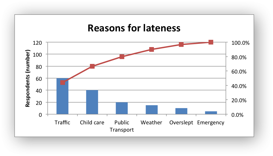
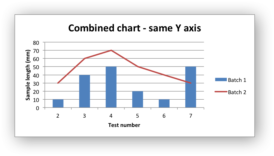
Combined Charts
It is also possible to combine two different chart types, for example
a column and line chart to create a Pareto chart using the Chart
combine method:
Here is a simpler example:
require 'write_xlsx'

workbook  = WriteXLSX.new('chart_combined.xlsx')
worksheet = workbook.add_worksheet()
bold      = workbook.add_format(bold: 1)

# Add the worksheet data that the charts will refer to.
headings = ['Number', 'Batch 1', 'Batch 2']
data = [
    [ 2,  3,  4,  5,  6,  7 ],
    [ 10, 40, 50, 20, 10, 50 ],
    [ 30, 60, 70, 50, 40, 30 ]
]

worksheet.write( 'A1', headings, bold )
worksheet.write( 'A2', data )

#
# In the first example we will create a combined column and line chart.
# They will share the same X and Y axes.
#

# Create a new column chart. This will use this as the primary chart.
column_chart = workbook.add_chart(type: 'column', embedded: 1)

# Configure the data series for the primary chart.
column_chart.add_series(
    name:       '=Sheet1!$B$1',
    categories: '=Sheet1!$A$2:$A$7',
    values:     '=Sheet1!$B$2:$B$7'
)

# Create a new column chart. This will use this as the secondary chart.
line_chart = workbook.add_chart(type: 'line', embedded: 1)

# Configure the data series for the secondary chart.
line_chart.add_series(
    name:       '=Sheet1!$C$1',
    categories: '=Sheet1!$A$2:$A$7',
    values:     '=Sheet1!$C$2:$C$7'
)

# Combine the charts.
column_chart.combine(line_chart)

# Add a chart title and some axis labels. Note, this is done via the
# primary chart.
column_chart.set_title(name: 'Combined chart - same Y axis')
column_chart.set_x_axis(name: 'Test number')
column_chart.set_y_axis(name: 'Sample length (mm)')


# Insert the chart into the worksheet
worksheet.insert_chart('E2', column_chart)
The secondary chart can also be placed on a secondary axis using the methods shown in the previous section.
In this case it is just necessary to add a y2_axis parameter to the
series and, if required, add a title using set_y2_axis(). The
following are the additions to the previous example to place the
secondary chart on the secondary axis:
...

line_chart.add_series(
    name:       '=Sheet1!$C$1',
    categories: '=Sheet1!$A$2:$A$7',
    values:     '=Sheet1!$C$2:$C$7',
    y2_axis:    1
)

...

column_chart.set_y2_axis(name: 'Target length (mm)')
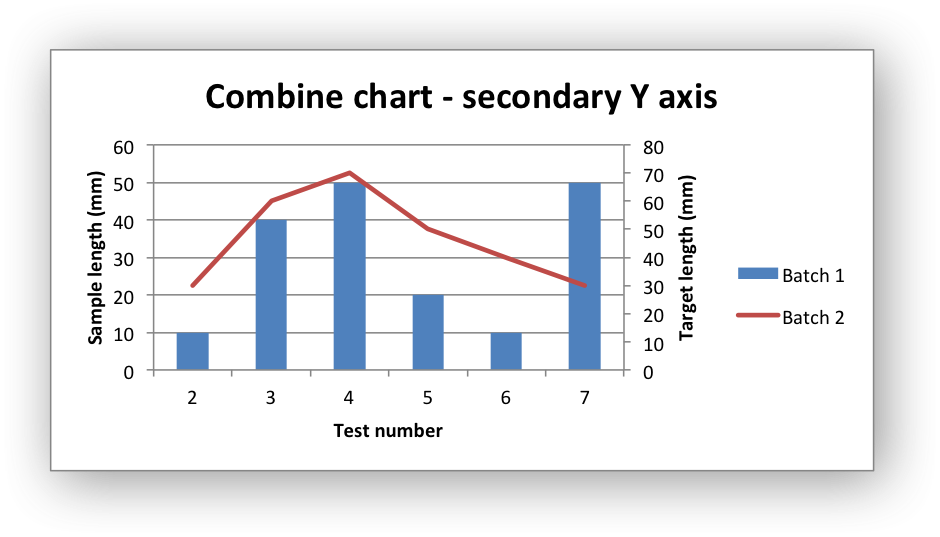
The examples above use the concept of a primary and secondary chart. The primary chart is the chart that defines the primary X and Y axis. It is also used for setting all chart properties apart from the secondary data series. For example the chart title and axes properties should be set via the primary chart.
See also chart_combined.rb and chart_pareto.rb examples in the
distro for more detailed examples.
There are some limitations on combined charts:
- Pie charts cannot currently be combined.
- Scatter charts cannot currently be used as a primary chart but they can be used as a secondary chart.
- Bar charts can only combined secondary charts on a secondary axis. This is an Excel limitation.