CONTENTS
- DESCRIPTION
- SYNOPSIS
- EXAMPLES
- WORKBOOK METHOD
- WORKSHEET METHOD
- PAGE SET-UP METHOD
- CELL FORMATTING
- FORMAT METHODS
- COLORS IN EXCEL
- DATES AND TIME IN EXCEL
- OUTLINES AND GROUPING IN EXCEL
- DATA VALIDATION IN EXCEL
- CONDITIONAL FORMATTING IN EXCEL
- SPARKLINES IN EXCEL
- TABLES IN EXCEL
- FORMURAS AND FUNCTIONS IN EXCEL
- CHART METHODS
- CHART FONTS
- CHART LAYOUT
- SHAPE
- COMPATIBILITY WITH WRITEEXCEL
SYNOPSIS
To create a simple Excel file with a Bar chart using WriteXLSX:
require 'write_xlsx'

workbook  = WriteXLSX.new('chart.xlsx')
worksheet = workbook.add_worksheet

chart     = workbook.add_chart(type: 'bar')

# Configure the chart.
chart.add_series(
    categories: '=Sheet1!$A$2:$A$7',
    values:     '=Sheet1!$B$2:$B$7'    )

# Add the worksheet data the chart refers to.
data = [
    [ 'Category', 2, 3, 4, 5, 6, 7 ],
    [ 'Value',    1, 4, 5, 2, 1, 5 ]
]

worksheet.write('A1', data)

workbook.close
DESCRIPTION
This module implements Area charts for WriteXLSX.
The chart object is created via the Workbook add_chart() method:
chart = workbook.add_chart(type: 'bar')
Once the object is created it can be configured via the following methods that are common to all chart classes:
chart.add_series
chart.set_x_axis
chart.set_y_axis
chart.set_title
These methods are explained in detail in Chart. Class specific methods or settings, if any, are explained below.
Bar Chart Subtype
The Bar chart module also supports the following sub-types:
'stacked'
'percent_stacked'
These can be specified at creation time via the add_chart() Worksheet method:
chart = workbook.add_chart(type: 'bar', subtype: 'stacked')
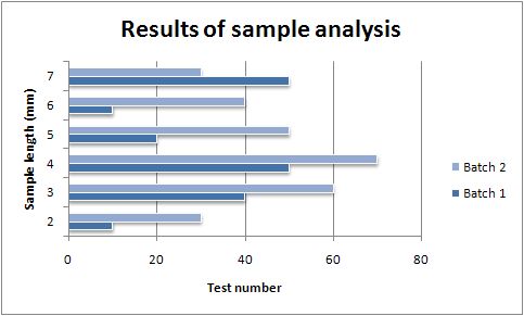
EXAMPLE
Here is a comlete example that demonstrates most of the available feature when creating a chart.
require 'write_xlsx'

workbook  = WriteXLSX.new('chart_bar.xlsx')
worksheet = workbook.add_worksheet
bold      = workbook.add_format(bold: 1)

# Add the worksheet data that the charts will refer to.
headings = [ 'Number', 'Batch 1', 'Batch 2' ]
data = [
    [ 2, 3, 4, 5, 6, 7 ],
    [ 10, 40, 50, 20, 10, 50 ],
    [ 30, 60, 70, 50, 40, 30 ]
]

worksheet.write('A1', headings, bold)
worksheet.write('A2', data)

# Create a new chart object. In this case an embedded chart.
chart = workbook.add_chart(type: 'bar', embedded: 1)

# Configure the first series.
chart.add_series(
    name:       '=Sheet1!$B$1',
    categories: '=Sheet1!$A$2:$A$7',
    values:     '=Sheet1!$B$2:$B$7'
)

# Configure second series. Note alternative use of array ref to define
# ranges: [ sheetname, row_start, row_end, col_start, col_end ].
chart.add_series(
    name:       '=Sheet1!$C$1',
    categories: [ 'Sheet1', 1, 6, 0, 0 ],
    values:     [ 'Sheet1', 1, 6, 2, 2 ]
)

# Add a chart title and some axis labels.
chart.set_title(name: 'Results of sample analysis')
chart.set_x_axis(name: 'Test Number')
chart.set_y_axis(name: 'Sample length(mm)')

# Set an Excel chart style. Blue colors with white outline and shadow.
chart.set_style(11)

# Insert the chart into the worksheet (with an offset).
worksheet.insert_chart('D2', chart, 25, 10)

workbook.close
This will produce a chart that looks like this: