CONTENTS
- DESCRIPTION
- SYNOPSIS
- EXAMPLES
- WORKBOOK METHOD
- WORKSHEET METHOD
- PAGE SET-UP METHOD
- CELL FORMATTING
- FORMAT METHODS
- COLORS IN EXCEL
- DATES AND TIME IN EXCEL
- OUTLINES AND GROUPING IN EXCEL
- DATA VALIDATION IN EXCEL
- CONDITIONAL FORMATTING IN EXCEL
- SPARKLINES IN EXCEL
- TABLES IN EXCEL
- FORMURAS AND FUNCTIONS IN EXCEL
- CHART METHODS
- CHART FONTS
- CHART LAYOUT
- SHAPE
- COMPATIBILITY WITH WRITEEXCEL
SYNOPSIS
To create a simple Excel file with a Pie chart using WriteXLSX:
require 'write_xlsx'

workbook  = WriteXLSX.new('chart.xlsx')
worksheet = workbook.add_worksheet

chart     = workbook.add_chart(type: 'pie')

# Configure the chart.
chart.add_series(
    categories: '=Sheet1!$A$2:$A$7',
    values:     '=Sheet1!$B$2:$B$7'    )

# Add the worksheet data the chart refers to.
data = [
    [ 'Category', 2, 3, 4, 5, 6, 7 ],
    [ 'Value',    1, 4, 5, 2, 1, 5 ]
]

worksheet.write('A1', data)

workbook.close
DESCRIPTION
This module implements Doughnut charts for WriteXLSX.
The chart object is created via the Workbook add_chart() method:
chart = workbook.add_chart(type: 'pie')
Once the object is created it can be configured via the following methods that are common to all chart classes:
chart.add_series
chart.set_title
These methods are explained in detail in Chart. Class specific methods or settings, if any, are explained below.
Pie Chart Methods
set_rotation()
The set_rotation() method is used to set the rotation of the first segment of a
Pie/Doughnut chart. This has the effect of rotating the entire chart:
chart.set_rotation(90)
The angle of rotation must be 0 <= rotation <= 360.
User Defined Colors
It is possible to define chart colors for most types of WriteXLSX charts
via the add_series() method.
However, Pie/Doughnut charts are a special case since each segment is represented
as a point so it is necessary to assign formatting to each point in the series:
chart.add_series(
    values: '=Sheet1!$A$1:$A$3',
    points: [
        { fill: { color: '#FF0000' } },
        { fill: { color: '#CC0000' } },
        { fill: { color: '#990000' } }
    ]
)
See the main Chart documentation for more details.
Pie charts support leader lines:
chart.add_series(
    name:        'Doughnut sales data',
    categories:  [ 'Sheet1', 1, 3, 0, 0 ],
    values:      [ 'Sheet1', 1, 3, 1, 1 ],
    data_labels: {
        series_name:  1,
        percentage:   1,
        leader_lines: 1,
        position:     'outside_end'
    }
)
Note: Even when leader lines are turned on they aren’t automatically visible in Excel or WriteXLSX. Due to an Excel limitation (or design) leader lines only appear if the data label is moved manually or if the data labels are very close and need to be adjusted automatically.
Unsupported Methods
A Pie chart doesn’t have an X or Y axis so the following common chart methods are ignored.
chart.set_x_axis()
chart.set_y_axis()
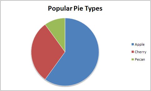
EXAMPLE
Here is a comlete example that demonstrates most of the available feature when creating a chart.
require 'write_xlsx'

workbook  = WriteXLSX.new('chart_pie.xlsx')
worksheet = workbook.add_worksheet
bold      = workbook.add_format(bold: 1)

# Add the worksheet data that the charts will refer to.
headings = [ 'Category', 'Values' ]
data = [
    [ 'Glazed', 'Chocolate', 'Cream' ],
    [ 50,       35,          15      ]
]

worksheet.write('A1', headings, bold)
worksheet.write('A2', data)

# Create a new chart object. In this case an embedded chart.
chart = workbook.add_chart(type: 'pie', embedded: 1)

# Configure the series. Note the use of the array ref to define ranges:
# [ sheetname, row_start, row_end, col_start, col_end ].
chart.add_series(
    name:       'Pie sales data',
    categories: [ 'Sheet1', 1, 3, 0, 0 ],
    values:     [ 'Sheet1', 1, 3, 1, 1 ]
)

# Add a title.
chart.set_title(name: 'Popular Pie Types')

# Set an Excel chart style. Colors with white outline and shadow.
chart.set_style(10)

# Insert the chart into the worksheet (with an offset).
worksheet.insert_chart('C2', chart, 25, 10)

workbook.close
This will produce a chart that looks like this: